Design
Designing for AI-Generated UI: Why Vibe Coding Still Needs a Designer
16 Sept 2026 · 11 min read
A clickable prototype used to take two days. Now it takes twenty minutes. That's not a productivity story. It's a different job.
Eighteen months ago, a founder without design training trying to build their own interface was obvious within thirty seconds — broken spacing, missing empty states, buttons that didn't look clickable. Today they describe an interface to Stitch, v0, or Lovable and get something that looks like a real product. The visual competence floor hasn't just risen. It's flattened. Everyone's standing on roughly the same ground now.
That should worry designers. I get why it feels that way, but most of the arguments on either side of this — "AI is coming for your job" or "it's just a tool, relax" — are arguing about the wrong layer of the problem.
What actually changed
The honest version of this shift is economic, not creative. A founder can go from blank page to a working, styled interface in the time it takes to make coffee. That collapses the cost of exploring a direction from a day of a designer's time to a prompt. Teams that used to commit early because testing three directions was expensive can now test six before lunch.
Google Stitch pushed this further in 2025 and 2026 by making the interaction itself conversational: you iterate through description rather than direct manipulation. That's a genuinely new way of working, not just a faster version of the old one.
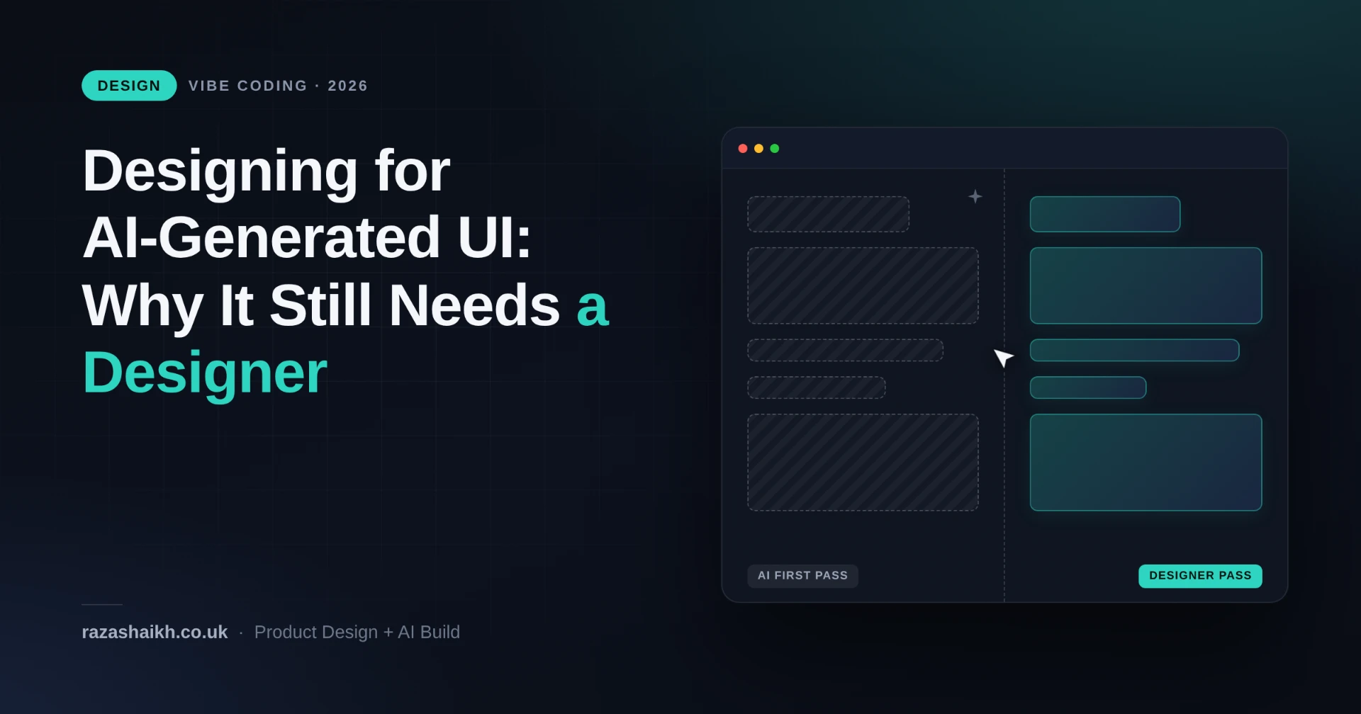
What the tool comparison sites don't lead with, though: AI-generated UI is a high-fidelity wireframe with a bunch of wrong decisions baked into it, dressed up well enough that the wrong decisions are hard to spot. That line is basically the whole post.
What AI is genuinely good at
To be fair to the tools, since a lot of designer commentary isn't:
Layout scaffolding — getting from nothing to a plausible grid, nav, and card layout used to be an hour of a junior's time. Now it's instant, and usually fine. Component boilerplate is strong too, if you're already working inside an established design system; Claude Code with a Figma MCP connection can generate production-adjacent code fast because the constraints already exist. And first-pass polish — consistent spacing, a sensible type scale, plausible color application — has genuinely closed the gap between "programmer art" and "designed."
None of that is nothing. For a solo founder or a two-person team, that's real leverage.
What breaks, every time
The failure mode isn't ugly UI. It's UI that looks considered but wasn't, in ways that only surface once real users and real data hit it.
Mental models. AI-generated interfaces are trained on the aggregate of every product pattern that exists, and your users aren't the aggregate. A dashboard for a compliance officer checking in once a week under deadline pressure needs a different information hierarchy than one for an ops manager who lives in it all day. AI doesn't know which one it's building unless you specify in enormous detail, and if you have to spec it that precisely, you've already done the design thinking yourself.
Edge cases. Empty states, error states, the thirteenth row when the table was designed around three. These need someone to sit and ask "what happens when this goes wrong," a deliberately pessimistic exercise that generative tools don't do by nature. They show the happy path because the happy path is what's in the training distribution.
System-level consistency. A design system isn't a style guide, it's a set of relationships: this component behaves like that one because they serve the same purpose, this spacing scale compounds predictably across screens. AI-generated components are often individually fine and collectively incoherent, because each generation is a fresh roll of the dice rather than a reference back to a system of decisions.
Distinctiveness. The one that matters most commercially and gets discussed least. Every tool draws from a similar training distribution, so AI-generated interfaces converge toward a similar visual center of gravity: competent, clean, interchangeable with your competitor's. A product with a visual character recognizable without its logo only comes from a designer making opinionated decisions that compound into a point of view over time. That's not a prompt.
The uncomfortable parallel from the code side
It's worth looking at what's already happened on the engineering side of vibe coding, because UI is heading the same way on a lag.
The data on AI-generated code in production is blunt. Across surveyed teams, somewhere between 0% and 40% of AI-generated code ships unmodified, clustering toward the low end. 89% of developers report spending moderate to significant time correcting AI output; only 11% need minor tweaks. Independent analysis from CodeRabbit found AI-generated code carries 2.74x the vulnerability rate of human-written code, and is 75% more likely to contain logic errors.
The pattern behind those numbers: AI is excellent at zero-to-one and genuinely risky at one-to-scale, because it has no memory of why an earlier decision was made. A founder ships an MVP with Lovable or Bolt, it gets traction, and then SSO, browser-compatibility bugs, and database scaling show up — demands the tool never prepared them for, since it optimized for looking finished fast, not for staying maintainable. There's now a small cottage industry of developers whose actual job is vibe-code cleanup.
Design is heading toward its own version of this. The MVP interface looks credible in the demo. Six months later there are forty screens with no shared logic and no one who can explain why the settings page behaves differently from everything else, because nobody made that call. An AI made forty separate, locally reasonable, globally incoherent calls instead.
A three-layer way to actually use these tools
Exploration — Stitch, Claude Artifacts, quick AI mockups. Use these to test five directions in an afternoon instead of debating one for a day. Throw away everything except the decision it helped you reach. Nothing from this layer touches production.
Build — v0, Lovable, Bolt. Once a direction is chosen, use these to get a working, clickable version fast, for user testing or a stakeholder demo or validating a flow before real engineering time goes in. Still disposable. Treat the output as a draft wearing a confident haircut.
Precision — hand-built, or AI-assisted-but-supervised, inside your actual design system, using tools like Claude Code with Figma MCP so generation respects existing components instead of inventing new ones. This is the only layer that should ship.
Almost everyone's mistake is skipping straight from exploration to shipped, because exploration-layer output already looks finished. It isn't.
The real threat isn't to designers. It's to junior designers.
The compressed layer is exactly the one junior designers used to learn on. Wireframing, first-pass prototyping, translating a vague stakeholder request into a rough layout — that used to be apprenticeship work, and it's now largely automated. The skill that used to develop over two or three years, judgment, now needs to be taught more deliberately and earlier, because the low-stakes reps that used to build it are gone.
If you're working with these tools daily, the two skills worth building right now are rapid, accurate evaluation of AI output (spotting the wrong decision inside the polished wrapper, fast) and precise articulation of what needs to change and why. Both are judgment skills. Neither shows up on a tool comparison chart. Both are exactly what's still worth paying a designer for.
The floor rose. The ceiling didn't move.